Choosing a Paint Color for the Cabinets
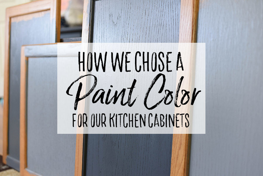 Choosing a color for kitchen cabinets is not for the faint of heart. I know that sounds dramatic, but it makes a huge difference in the outcome of the room. Of course, the popular choice right now would be to paint the cabinets white, which would have been fine but not exactly our style.
I thought that I wanted light wood countertops and a white subway tile backsplash, which I think needs a bit more contrast than white cabinets would provide. So, I scoured Pinterest and design blogs searching for colors that stood out.
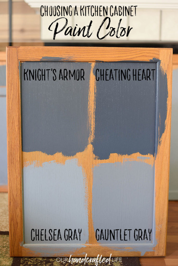
While I think they’re gorgeous, I wasn’t quite ready to commit to a navy blue or a forest green, so we settled on a shade of gray and picked out several colors to get samples of at the hardware store.
Choosing a Kitchen Cabinet Paint Color
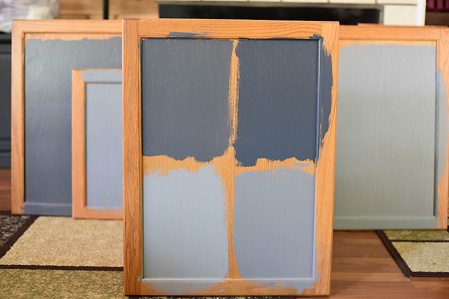
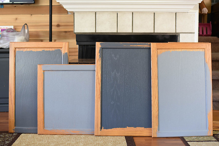
We brought the paint home and started painting directly on our cabinets because we’re a little impulsive and a little crazy.
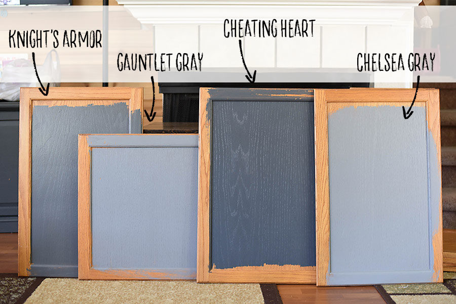
Now, I must confess that I gasped audibly when my husband brushed Cheating Heart onto the cabinets. The rich, dramatic color with blue undertones took my breath away and I immediately fell in love.
Unfortunately, I decided it really wouldn’t be right for our space for a couple of reasons. First, our kitchen is pretty small and we don’t have a ton of natural light, so that color would seem very dark in our space. Second, I realized that I loved this color more for its mid-century modern flair. I caught myself daydreaming about the color paired with polished copper handles and sleek open shelving. I have been flirting with mid-century modern design lately, but I’m definitely not willing to commit myself to it. I just want a set of Eames chairs and we can call it good.
Ultimately I decided that I want to date Mid-Century Modern design and marry an English Country Cottage. I want to design my teardrop trailer (the one I don’t own yet, but that will definitely be in my near future) with a mid-century modern flair. It will have copper fixtures and the cheating heart color will be absolutely perfect.
But my kitchen? I want my kitchen to feel like I just stepped in from my paddock on the countryside and I’m prepping to put my saucy pud in the range. (I may be watching too much British TV…is anyone else obsessed with shows like The Great British Baking Show and Escape to the Country? It can’t just be me!). Soft tones, warm woods, and cozy decor are the marks of a great country cottage.
So, our choices were between Gauntlet Gray and Knight’s Armor. I was initially leaning more towards Gauntlet Grey because it is a little lighter and I thought it would coordinate with the wood nicely. It was a little more ‘farmhouse’ than ‘country cottage’.
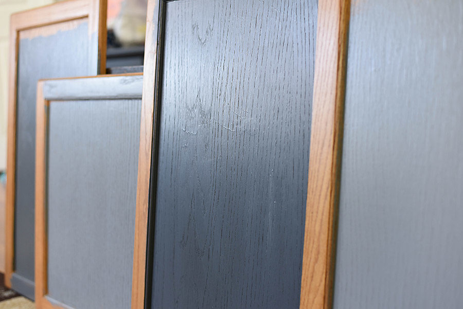
It wasn’t until I saw the white oak and white subway tile next to the paint swatches that I knew it had to be Knight’s Armor. The rich, strong color perfectly contrasts the warm wood and is highlighted by the subway tile. It’s bold enough to make a statement, but light enough to keep our kitchen bright and airy.
So, Knight’s Armor it is! What do you think? Which color would you have picked?
Where is the color you chose (Knights Armor) from?
Hi Joanne! Thanks for commenting. It’s Olympic paint from Lowe’s. Let me know if you have any other questions!
What brand of paint is gauntley grey did you buy?
Hi Jessica! It’s from Sherwin Williams!
What brand of paint is the Cheating Heart?Thanks
I have a small galley kitchen and think the Chelsea gray is what I need because it’s a bit lighter, what brand is it?
Hi Megan. Your initial color choices are soooo close to what we’ve been looking at for our kitchen. I love the darker colors too and we are struggling with taking the plunge. It’s new construction and the kitchen is not small. After reading your article, my husband said “let’s just go with the darker color we like”. What color hardware did you choose? I’m thinking brushed nickel.